Its A Trap!
Here's how I (with the help of some friends) mapped out speed traps on Texas roads.

Background:
This was a project for UTA Open Data Day back in March 2020, my last pre-covid hackathon (or at least before it was taken seriously). The theme for this hackathon was "Movement", and the goal was to use data related to movement for some kind of public good. After a bit of discussion with my team and some browsing through some available data sets on kaggle we ran into an interesting listing of Texas Highway Patrol issued tickets. After coming to the quick consensus that speed traps are the enemy, our goal became mapping out the tickets and finding out where speed traps are located.
The Data:
During the hackathon we had trouble locating the data, the TxDPS site went down which led to us pulling an old CSV from a web cache to work off of until the site went back up later that day.
The datasets are presented as CSVs with all traffic tickets issued within the respective month, and a ton of related data—notably for this project, GPS coordinates. Each CSV is ~200 MB, so it's a sizable amount, and we threw out a lot of it for this project. If you end up doing something cool with this data be sure to tag me! I definitely plan or revisiting this at some point in the future to look for more interesting patterns.
As of writing this in December 2020, here's how you can download the CSVs. Data seems to get publicised at the end of each year, and data from the previous year is marked as "Preliminary" which from what I can tell is not different in any way, I assume this just means that it's subject to change.
For data from the previous calendar year use the direct download link:
https://www.dps.texas.gov/HighwayPatrol/docs/{YYYY}Violations/{YYYY}-{MM}Preliminary.csvFor any older data use the direct download link:
https://www.dps.texas.gov/HighwayPatrol/docs/{YYYY}Violations/{YYYY}-{MM}.csvRecords seem to start at January of 2013.
Making Our Data Useful:
There's a surprising amount of weird outliers in this dataset, and we were only interested in speeding tickets with GPS data available. We did most of the data processing in R. If you aren't familiar with R it's a language made specifically for data science applications, and has some really interesting functionality built in. If you want a quick overview check out learnxinyminutes.com. All credit to my teammate Nikita for this code, he made a short annotated write-up during the hackathon if you're interested in the details.
In short though here's what the code does:
- Remove all non-speeding tickets
- Remove tickets missing locations or speeds
- Remove tickets where drivers were cited for going below the limit (ex. 5 mph in a 60 mph zone)
- Remove tickets where the posted limit was 0mph (no idea why these exist)
- Calculate a risk factor based on delta from speed limit (ticket for 5 mph over is weighted higher than ticket for 60 mph over)
- Output to CSV file for loading on the webpage
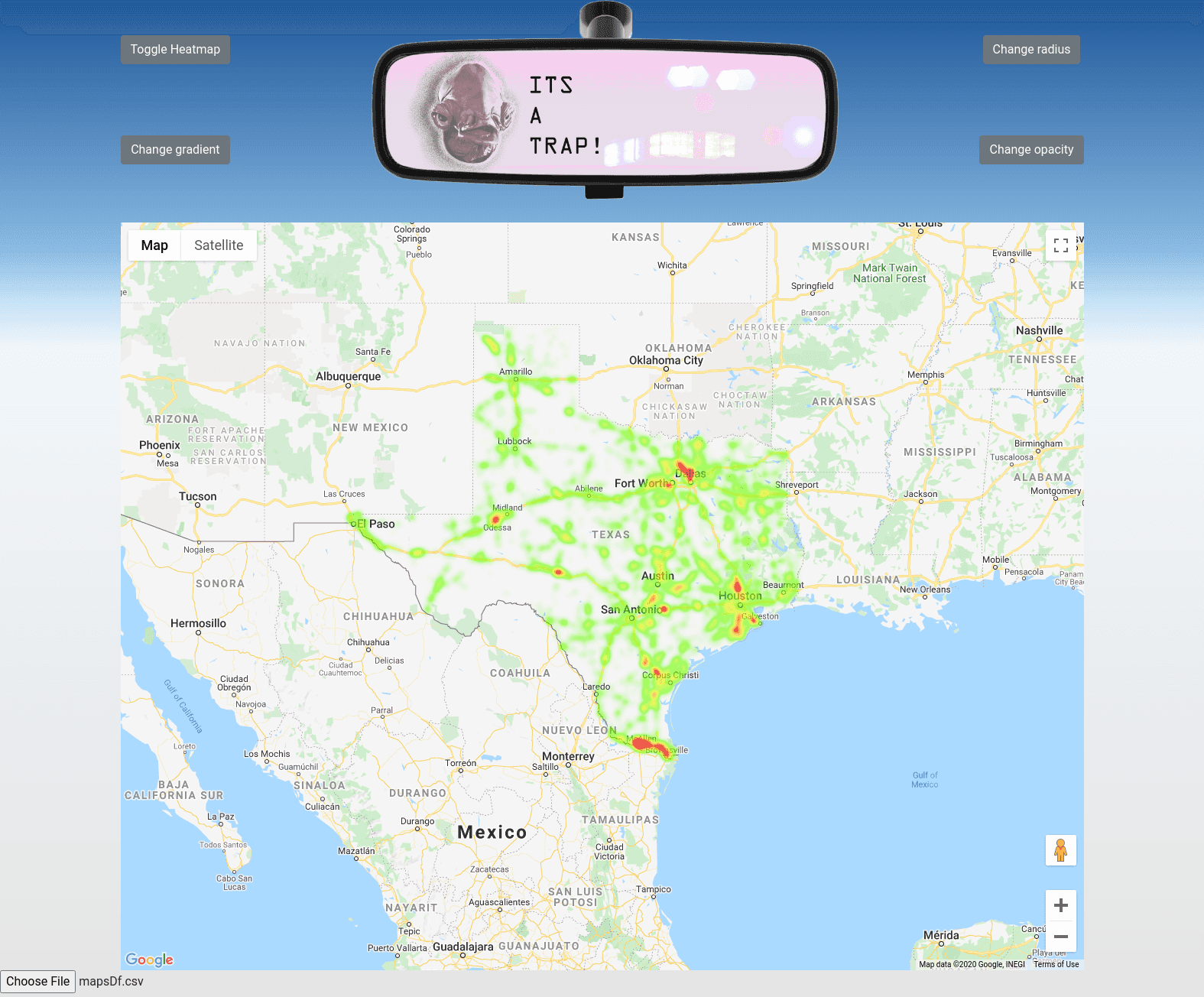
Presenting the Data:
In order to actually show off this data we opted to utilize the Google Maps Javascript API, specifically the heatmap layer functionality. It's a dead simple solution that required minimal effort to make look good, so all we had to do was plug in our data.
The hackathon solution:
The web page required the client to select a processed CSV file to be displayed using a button in the bottom left. The button event was then handled with jQuery and Papa Parse CSV parser:
<!--Button HTML-->
<script> jQueryHandling(); </script>
<input type="file" id="csv-file" name="files"/>
// Button JavaScript
function jQueryHandling() {
// event handler
function handleFileSelect(evt) {
var file = evt.target.files[0];
// parse CSV
Papa.parse(file, {
header: true,
dynamicTyping: true,
complete: function (results) {
data = results;
// update heatmap
fixHeatMap();
}
});
}
// event trigger
$(document).ready(function () {
$("#csv-file").change(handleFileSelect);
});
}fixHeatMap() takes the parsed CSV file stored in data and uses it to create points on the map:
function fixHeatMap() {
var arr = data.data;
for (var i = 0; i < arr.length - 1; i++) {
var latitudeTemp = arr[i].Latitude;
var lonTemp = arr[i].Longitude;
var tempVar = {location: new google.maps.LatLng(latitudeTemp, lonTemp), weight: arr[i].Weight * 15};
heatArray.push(tempVar);
}
// Have you tried turning it off and on again?
toggleHeatmap();
toggleHeatmap();
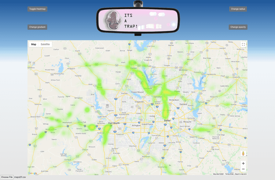
}And tada! We have our minimum viable product. If we zoom in on the DFW area we can see which areas are heavily patrolled
by law enforcement.
 If you're interested in the full code it's available on my github. I've added
some short instructions to the readme if you want to poke around at it right now, but you'll need to provide your own
API key.
If you're interested in the full code it's available on my github. I've added
some short instructions to the readme if you want to poke around at it right now, but you'll need to provide your own
API key.
What's next for this project:
I'd like to wrap the map section and related javascript into a React component so that I can cleanly embed it within my website. Along with that I'd remove the manual data selection and instead have it reference a file hosted on my web server. Once the new year rolls over I'll have more recent data available, and I may add a few more features to the R script which generates the data frame and try to have more values calculated into the risk factor. If I end up going this route I'll be sure to make another write-up over that process, and likely give some insights as to how I've automated the process of adding content to my site. Say tuned if you want to see more!